Logo Mistakes Your Nonprofit Won’t Want to Make
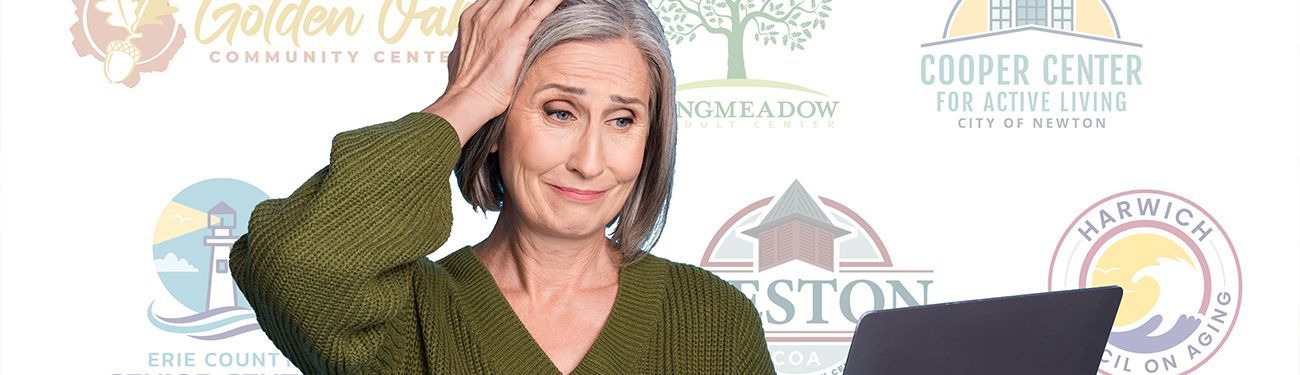
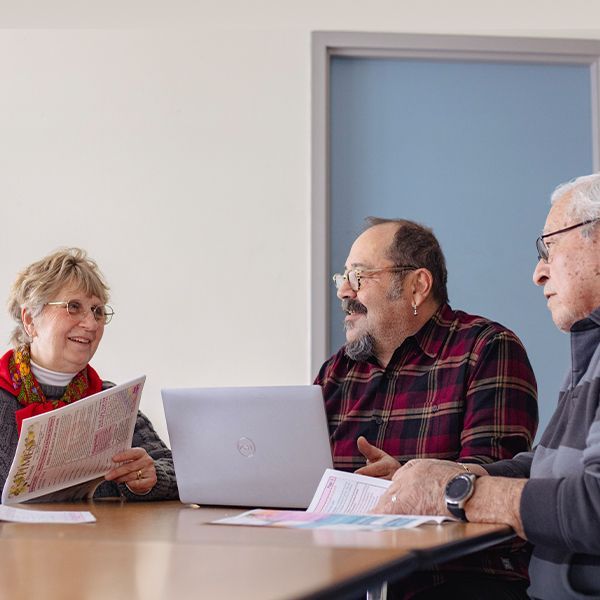
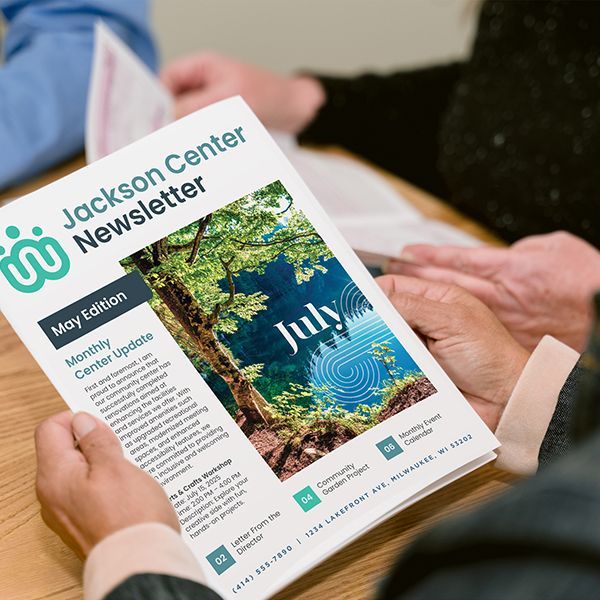
An organization’s logo is more than just a graphic — it’s a reflection of your community’s mission, identity, and purpose. A great logo helps communicate your story, unify your members, and create a welcoming first impression for visitors.
Whether you’re refreshing your current logo or starting from scratch, avoiding these common design mistakes will ensure that your logo serves you well for years to come. Let’s dive into a few logo pitfalls that nonprofits sometimes encounter and learn how to steer clear of them.
1. Incorporating Too Many Elements
It’s tempting to want your logo to say everything about your organization. While it’s great to feel passionate about telling your story, cramming too many details into one logo will unfortunately overwhelm your audience and dilute your message.
Why it’s a Mistake:
- Busy logos are hard to recognize and even harder to remember.
- Small details get lost when printed on smaller items like business cards or mugs.
- Overcomplicated logos may look cluttered and discourage people from engaging.
Best Practice: Focus on one or two elements that are meaningful to your community. A clean, clear design will have a greater impact and better longevity. For some examples, check out these painterly, illustrative, and architectural logo examples on our website.
2. Using Outdated Clipart
Using clipart in your logo gives off a dated and unprofessional vibe. People these days are accustomed to polished branding everywhere they look — from schools and sports clubs to businesses and online communities. Clipart sends the wrong message about your nonprofit’s vitality.
Why it’s a Mistake:
- Clipart often lacks uniqueness and fails to tell your organization’s specific story.
- It can unintentionally signal that your nonprofit is stuck in the past or doesn’t prioritize outreach.
Best Practice: Work with a professional designer to create something fresh and custom for your community.
Our designers work with nonprofits across the United States to create brands and logos that represent them. Trust the professionals!
3. Choosing Too Many Fonts or Fonts That Are Hard to Read
Unique, ornate fonts can look appealing at first glance, but when they’re too complex, too small, or poorly spaced, they become difficult to read. Remember, your logo needs to be readable by all ages, in all settings, and at all sizes — whether on a billboard, a bulletin, or a social media profile.
Why it’s a Mistake:
- Complex or cursive fonts may alienate viewers, especially those with visual impairments.
- Multiple fonts within one logo can also create visual chaos.
Best Practice: Stick with one or two clean, readable fonts that balance modern appeal with timeless simplicity. Test your design with your community’s members to ensure clarity success.
4. Using Too Many Colors
Color is a powerful communication tool. It evokes emotions, reinforces your mission, and enhances the impact of your logo. Too many colors, however, can create visual clutter and make the design feel chaotic to viewers. Plus, more colors often mean higher printing costs for materials like apparel or signage.
Why it’s a Mistake:
- Logos with too many colors are harder to reproduce in print or embroidery.
- Color overload can overwhelm viewers and distract from the logo’s main message.
Best Practice: Choose two or three complementary colors that align with your unique nonprofit identity and the mission you are conveying. Don’t forget to also ensure that your design works in black and white for versatility.
5. Neglecting Scalability
Your logo is meant to appear on websites, social media, bulletins, banners, business cards, and beyond. If your design doesn’t look good at both large and small sizes, its impact will be lost.
Why it’s a Mistake:
- Intricate details or thin lines may disappear when scaled down.
- A logo that’s not adaptable won’t serve all your organization’s needs.
Best Practice: Ensure your logo is simple and clear enough to work at any size. A professional designer will test its scalability across different platforms and formats while creating your perfect design.
6. Failing to Reflect Your Mission
A great nonprofit logo visually conveys your organization’s mission and values. If your logo lacks meaning or feels disconnected from your identity, it won’t resonate with your community or inspire engagement.
Why it’s a Mistake:
- A generic logo misses an opportunity to reflect your community’s unique story.
- It may feel impersonal and fail to connect with your members or staff on an emotional level.
Best Practice: Start with your organization’s mission statement. Ask questions like:
- What is at the heart of our community?
- Are there symbols, actions, or local features that define us?
- What feelings do we want our logo to evoke?
Choose design elements that authentically reflect who you are as an organization.
Ready for Your Perfect Logo?
If you’re feeling overwhelmed, we’re here to help! Our team has worked with nonprofit organizations across the country to create beautiful, impactful logos that reflect their unique identities. Whether you’re starting fresh or simply need a whole brand refresh, we’d love to help your community shine.
Contact us today to learn more about our logo and branding services. Your nonprofit has a story worth telling — let’s bring it to life together!
Share
You might also like