This, Not That — Simple Swaps for Better Newsletters
Your newsletter is important! As one of your organization’s main sources of communication with your members, you want it looking top-notch — easy to navigate, approachable for newcomers, packed with engaging content, and intentionally designed to be as vibrant and beautiful as your community!
Chances are good that your newsletter editor spends a lot of time carefully creating each publication. With this in mind, we collected some tips from our LPi professional designers that can help you easily give your newsletter a fresh new look. After all, we are as invested as you are in the success of your communications!
Design
Swap out — Large columns of text that run across the whole page.
Instead — Utilize a two or three-column format for your pages and stick to that throughout. It makes the publication easier to read, especially if it is a text heavy newsletter! You can check out some great examples on our newsletter before and after page.
Swap out — Text box frames, colored lines, and strokes around text.
Instead — Use a light, color-neutral background behind one or two text boxes on the page to separate sections. Highlight a few items by using a vibrant color box if you want something to pop! This creates a sense of order, tailored approach, and a more unified message in your layout.
Swap out — Using too many fonts and colors.
Instead — Stay consistent with your brand colors, not only with the newsletter, but everything you publish or create as an organization. This makes anything you do instantly recognizable to your community and more appealing to newcomers.
As for fonts, find an easy-to-read font and utilize it with regular weight, bold, and italic. It’s fine if you want to use another font family for your headers but stick to that. Don't go inviting more font styles to the party as that can become busy and confusing for your readers. If you are using more than three different fonts, chances are you have some decisions to make about narrowing down your guest list of fonts.
In fact, if you don’t already have a brand book with pre-chosen fonts, colors, and a professionally-designed logo, we specialize in helping organizations like yours create a beautiful brand that can be used across all communications!
Swap out
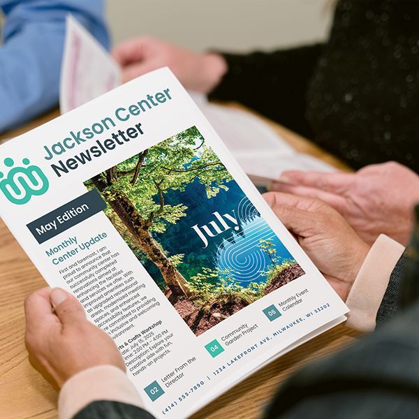
— Your old masthead.
Instead
— Update your information and design! We see so many newsletters using mastheads on the cover of their publication with designs that look like they’re from the 80s. Utilize your brand’s fonts and colors and make sure to include any updated pertinent information. Don’t forget to include information about your organization’s social media profiles, website, and hours you are open or available.
Swap out — Outdated logos.
Instead — If your logo is old and looks outdated, it’s certainly time for a logo refresh or even a brand-new design! We have created logos for countless organizations across the country so we have lots of experience and inspiration and are excited to help get you started if the need arises!
Content
Swap out — Over-packed pages.
Instead — Look to add white space and larger borders between your columns of text and content. Adding more white space helps your reader’s eyes rest and makes the experience of reading your newsletter easier and more enjoyable. Consider what you can remove for a stream-lined reading experience.
Swap out — Stretched images and clipart.
Instead
— Choose images that fit the space you want to fill already. Stretching an image to fit a space can cause the image to distort and immediately makes your design look careless. If you aren’t sure about your graphic design skills, we have thousands of professionally designed images specifically made for use in newsletters for you inside
WeCreate — our library of communications content.
Swap out — Adding your whole calendar of events to the publication.
Instead — Don’t overload your newsletter with too much content. Choose to highlight specific events and then point to your website’s event page for more. If you need help with your website, our web design tool, WeConnect, makes it incredibly easy to share your calendar online. We can even help you get started with the design work if you need.
Don’t get too specific about the events in your newsletter; simply shout the event out with a sentence or two and a great image. Don’t take up space with all the little details. Instead, use an event landing page on your website for that or add an event flyer as an insert to the newsletter with all the pertinent information there.
A few extras:
Did you know that LPi provides all sorts of options for newsletter content every week inside of WeCreate and that, if your organization is already publishing your newsletter with us, your staff already has access to our entire WeCreate library of content for free?
Consider dropping some of the following WeCreate content into your newsletter:
- New monthly articles
- Ready-to-make recipes
- Unique comics found nowhere else
- Games like word twist, crossword, sudoku, and more
- Cover designs and thousands of graphics
- Infographics … and more!
If you are already a newsletter customer but need help accessing your WeCreate account to make use of the incredible graphics and newsletter content available to you, get into touch with our customer service so that we can get you squared away!
Share
You might also like