Clear and Concise: Communication Tips for Writing Senior-Friendly Newsletters

Writing newsletters for a target audience of older adults requires thoughtful attention to clarity, simplicity, and accessibility. Because seniors often have vision-related challenges, such as cataracts or glaucoma, it’s important to craft newsletters that are easy to read, as well as engaging and informative.
Whether you’re writing an executive director’s letter, a health article, or a special event announcement, following these communication tips will help ensure that your message resonates with your senior audience.
Tips for Creating a Clear and Concise Newsletter
- Use simple, direct language
The first step in writing a senior-friendly newsletter is to keep the language clear and simple. Avoid jargon, slang, and technical terms that might confuse readers. Older adults might get frustrated and give up reading.
Instead, opt for short sentences with straightforward phrasing. For example, instead of writing “We encourage you to take part in a comprehensive wellness program,” try “Join us for a simple wellness program.” This is especially important for digital newsletters, which people tend to skim more quickly.
Make sure the tone is warm and approachable. Seniors are more likely to engage with content that feels personal and accessible. Use direct, inviting language that fosters a sense of inclusion. Instead of “It is recommended you participate in the event,” use “We’d love for you to join the event!”
- Use senior-friendly fonts
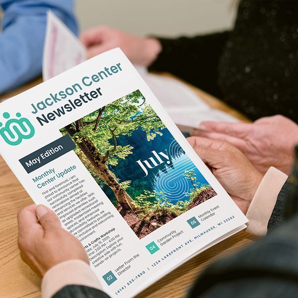
Font size and style are essential in senior-facing newsletters. Many older adults have experienced vision changes such as presbyopia (difficulty focusing on close objects) or other eye conditions that can make reading more difficult. That’s why it’s important to use large, clear fonts — 14 to 16 point is a good size — to ensure readability.
Font styles matter greatly, too. Arial, Calibri, and Times New Roman help make reading easier because they are simple and highly legible. Avoid decorative or script fonts, as they can be harder to read. Additionally, make sure there is enough space between lines (use line spacing of 1.5 or double) to avoid a cramped layout that could strain older eyes.
- Have clear headings and subheadings
Big blocks of copy can overwhelm the eye. Another best practice is to break up the text into sections with headings and subheadings in bold font. This allows seniors to scan the newsletter quickly and find the information that is most relevant to them. Keep headings short and to the point — such as “Upcoming Events,” “Health Tips,” or “Community Announcements” — so readers can immediately understand the content of each section.
Consider adding bullet points or numbered lists where appropriate, as this helps organize information into digestible chunks. Bullet points are ideal for summarizing key points, like event details or tips, which makes the content more accessible and less overwhelming.
- Use high-contrast colors
Color contrast plays an important role in readability for seniors, especially for those with visual impairments. Opt for high-contrast color schemes, such as dark text on a white or light-colored background. Avoid using pale text on light backgrounds, as this can be very tough for older adults to read.
If you include images or graphics, as you should, make sure they complement the text and aren’t too distracting. Ensure any image captions are large enough to be legible and there’s enough contrast to distinguish them from the background.
- Include a clear call to action
A newsletter should offer clear guidance on what to do next. Whether you want readers to attend an event, sign up for a program, or read additional resources, your call to action should be easy to follow. Use bold text or buttons that stand out and say exactly what you want the reader to do, such as “Call to RSVP” or “Join us on [date].”
If your newsletter is digital, consider including clickable links or buttons, but be sure to also offer alternatives for those who may prefer printed materials or have difficulty using technology.
Finally, if you are just beginning to develop a newsletter for your senior center or community organization, these
communication tips and articles might be of interest.
Take Advantage of LPi Newsletter Resources
We know senior center teams often need a helping hand to produce newsletters on a regular basis. If your team could use support, LPi is the solution. Organizations who print their newsletters with LPi receive a free, custom, newsletter template made by our professional design team. Check out some before and after examples of happy newsletter customers on our website!
Share
You might also like