How to Make Sure Your Organization's Website is Mobile-Friendly

Regular readers of our blog know that we place great value in digital marketing. Community organizations need to invest in online resources, whether it’s an e-newsletter full of great content that’s published on a routine schedule, or a website optimized to attract visitors. One of the opportunities we continue to see for enhancing your website experience is making sure it’s mobile-friendly.
Plenty of small organizations still haven’t taken this step. While it doesn’t happen as frequently as it used to, when people look them up online, especially from their smartphone, it often doesn’t go well. Only sections of the website appear, and the navigation is challenging at best. That leaves visitors feeling frustrated and makes them more likely to drop off your website.
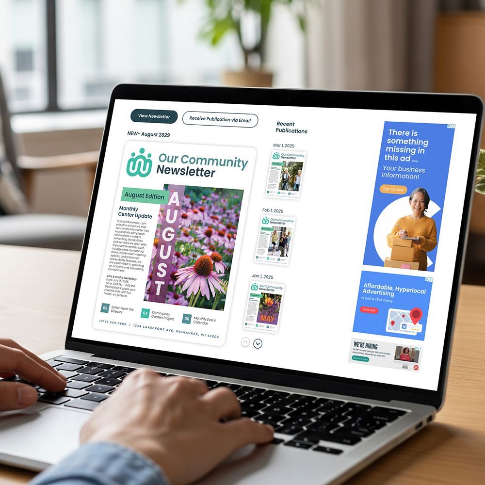
There are two avenues you can pursue to avoid this. One is with a responsive website, and the other is a mobile-friendly website. Today we’ll talk about what a mobile-friendly website is and how you can create one. We can also assist your endeavor to make your website as user friendly as possible with our effortless website tool, WeConnect.
What Is a Mobile-Friendly Website?
A mobile-friendly website is designed to work exactly the same way across devices. Unlike a responsive website that changes (responds) based on the device being used to view it, a mobile-friendly site has static content and modest navigation.
In the simplest of terms, nothing on the site changes or is unusable, whether you are using a computer or mobile device. Features like navigation drop-downs are used sparingly, as they can be tough to maneuver on mobile devices. Flash animation isn’t used, either.
What should you consider in the design of a mobile-friendly website for your small community organization? We have a few suggestions you’ll likely find useful.
Tips for Designing a Mobile-Friendly Website
- Check out the competition: As is recommended with any new marketing project of significant expense, begin by looking at what your competitors are doing. You might also want to find community organizations or senior centers in other locations and look at their websites. What do you like? Just as important, what don’t you like? Have a few people on your team, and possibly even some of your organization’s members or visitors, give their feedback. That will help you get some ideas to share with your web developer.
- Create for mobile experience: In the past, web developers encouraged clients to focus on how a website would appear on a desktop or laptop because that’s where most traffic came from. Today, it’s just the opposite. According to TechJury, mobile phones generated 60.66% of website traffic in 2022, while desktops and tablets accounted for 39.34%. It’s a trend that shows no sign of slowing down. Keep that in mind as you create your new site or update your existing one.
- Prioritize content you see first: When it comes to viewing content on a mobile device, you have to grab visitors fast. While experts don’t quite agree on the numbers, most say you have 3–8 seconds to capture someone’s attention online. Journalists have long used the phrase above the fold to describe the top section of a newspaper. It literally contains the stories you see when the paper is folded in half. Online, that translates to the content visitors engage with before they scroll down.
- Avoid feature dumping: Along those same lines, it’s best to avoid throwing too many features into your above the fold content. While you might be proud of them, it’s better to save them for lower on the page. Don’t slow things down with anything that takes too much time to load, or copy that doesn’t get right to the point. All the features you are proud of can come later on the page or on another page. Showcase the benefits instead. Confused about what to focus on?
Updated on 11-11-2025


