Fun Fillers for Your Senior Center Newsletters

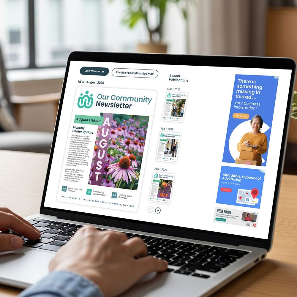
Newsletters are a great way to stay connected with members of your senior center or residents of your senior living community. With some thoughtful planning, you can make your piece both informational and entertaining. It’s a combination that is likely to increase the odds that, in a cluttered mailbox, your newsletter will be read and enjoyed.
One tip to keep in mind is not to inundate print readers and website visitors with copy. While it might all be good information, large blocks of written content can overwhelm the eye and put people off. Instead, break your newsletter up with fun fillers that provide visual interest and images that give the eye a place to rest. We recently published a simple guide on reader- friendly newsletter layouts if you want to dive deeper!
As for your content, make sure your newsletter includes a variety of material. Join us as we explore some fantastic options for newsletter content.
Filler Ideas to Make Your Newsletters Fun to Read
- Images: Photos are always fun to see, especially if they are from activities you’ve held at your center or community. People typically enjoy searching for themselves and other friends in the pictures. (Just make sure to include only those images that are flattering to everyone in the photo, so no one has hurt feelings!)
- Interesting or funny facts: This is another great way to keep your newsletter from being too copy heavy. For example, did you know that in Switzerland it’s illegal to own just one guinea pig? (They are social creatures who suffer when they are alone.) Or how about crows? Surprisingly, these often-misunderstood birds are capable of holding a grudge. You can find tidbits like these on free websites like The Fact Site and Mental Floss.
- Look back in history: Readers might also be amused to see historical facts that correspond to the month the newsletter is published. Consider the average ages of your senior center members or senior living community residents in choosing the years to revisit. For example, if your residents are mostly in their late 70s and you are publishing the newsletter in July, share stats from the summer of 1948 or 1949. HistoryNet is a good site to visit to search for facts by date or simply use the ”This Day in History” content available inside our digital library, WeCreate.
- Monthly contest: One more idea that can encourage more in-person visits is to incorporate a monthly contest. Include an entry form in a spot that makes it easy to tear off or print out. Readers can fill it out and drop it off at your location. Prizes don’t have to be expensive, and you might even be able to get local businesses to donate them. A car wash gift card, a basket of fruit, or even a bouquet of flowers can entice people to enter.
- Recipe of the month: Every few months, invite staff, residents, and members of your senior organization to submit short, simple-to-prepare recipes to add to your newsletter. While you likely won’t have space for anything too long, dips, appetizers, salads, and even baked goods can all work. It’s another way to help people feel more connected to your organization. You could also make use of the numerous recipes we have available in WeCreate, our library of art & content — ready to be dropped directly into your newsletter!
Use LPi's WeCreate to Fill Your Newsletter Pages
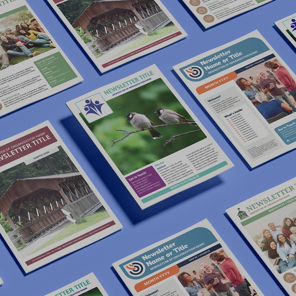
Speaking of WeCreate, we know that in an already-busy workday, the idea of putting together an ongoing newsletter might feel a little overwhelming. There’s no doubt that it can be time-consuming. One way to streamline the process is to take advantage of WeCreate, LPi’s digital library of art and content. It includes everything from newsletter templates to photography, illustrated quotes, puzzles, and more! All of WeCreate’s content is specially created with organizations like yours in mind. Simply drop images, articles, and more directly into your newsletter to look professional, stay relevant, and save time!
For more newsletter inspiration, be sure to browse the
“Newsletter Tools” section of our blog!
Updated 11-07-2025


